

I get asked often about the how to’s of designing a logo, so today I’m giving you some basic guidelines to follow if you choose to design your own logo. I also wanted to create a resource that I can point others to in the future. If you’re not at the point where you want to hire someone to design a logo for you, here are some tips to think about.
Where do I design a logo?
Canva is a great (and free!) platform to start with when designing a logo. It’s very user friendly and is the perfect starting point if you want to do it yourself and aren’t ready to spend money to have someone else design it.
Here’s a link that gives you some more information on how to get started with Canva.
Logo Design Guidelines
Pick one or two fonts to use in your logo. That’s it! Any more than that and it can quickly become too busy. Many times, it works well to have a font with serifs and a font without serifs.
Choose a limited color palette. That means probably two colors, but maybe three.
Use one to two font sizes for your logo. Consider using a larger font for one or two words, so that it calls attention to the main word.
Below is an example of the logo I designed for Kinzi at Healthy Home Help. I chose two colors - a dark green and a bright green, and used only two fonts. The words “home help” are the same font as the tagline, but I put the tagline in all caps to set it apart. Think about using lowercase and uppercase in one font to get a different but cohesive effect.

How are you going to use your logo?
As you design your logo, keep variations in mind. ClearVista Financial needed a logo refresh, and they also wanted a couple of different layouts. I reworked their logos to fit in a square and also fill a rectangle. Depending on the use, either one can work.
On social media, the square layout will work well. But on a banner, if they were to sponsor a golf tournament, for example, the rectangle logo works best.


Lastly, don’t forget to create a Favicon!
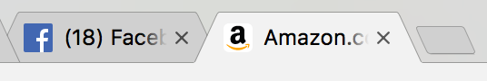
Do you know what a Favicon is? It’s the image that appears in your browser window like the “f” next to Facebook, or the “a” next to Amazon in the tabs up top.
This is a detail that sometimes gets forgotten, but it’s all about the details. This feature can look a little different than your logo. It’s really tiny, so I recommend keeping it simple. For example, here is the Mackenzie Baldwin logo, and also the Favicon we used on her website. Though they are different, if you know the brand the favicon is still similar enough to be instantly recognizable.

Hopefully this gives you a starting point and things to consider if you’re looking to design your own logo. I know it can be intimidating to start, but jump on Canva and start playing around. Put into practice the tips i’ve shared here and your logo will start taking shape in no time!
What other questions can I answer for you? I’d love to know!